Neems Reflexology
(Brand & Brand Identity, Motion Design, UI Design)
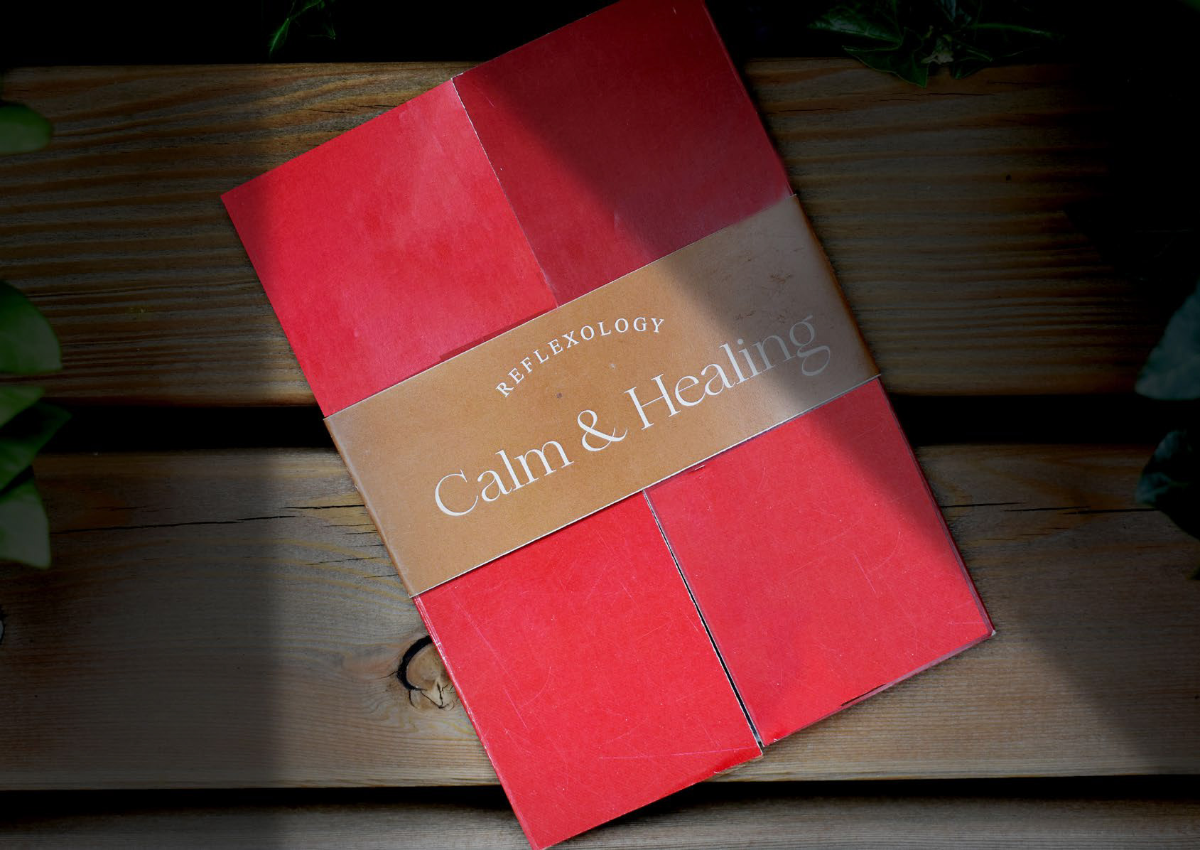
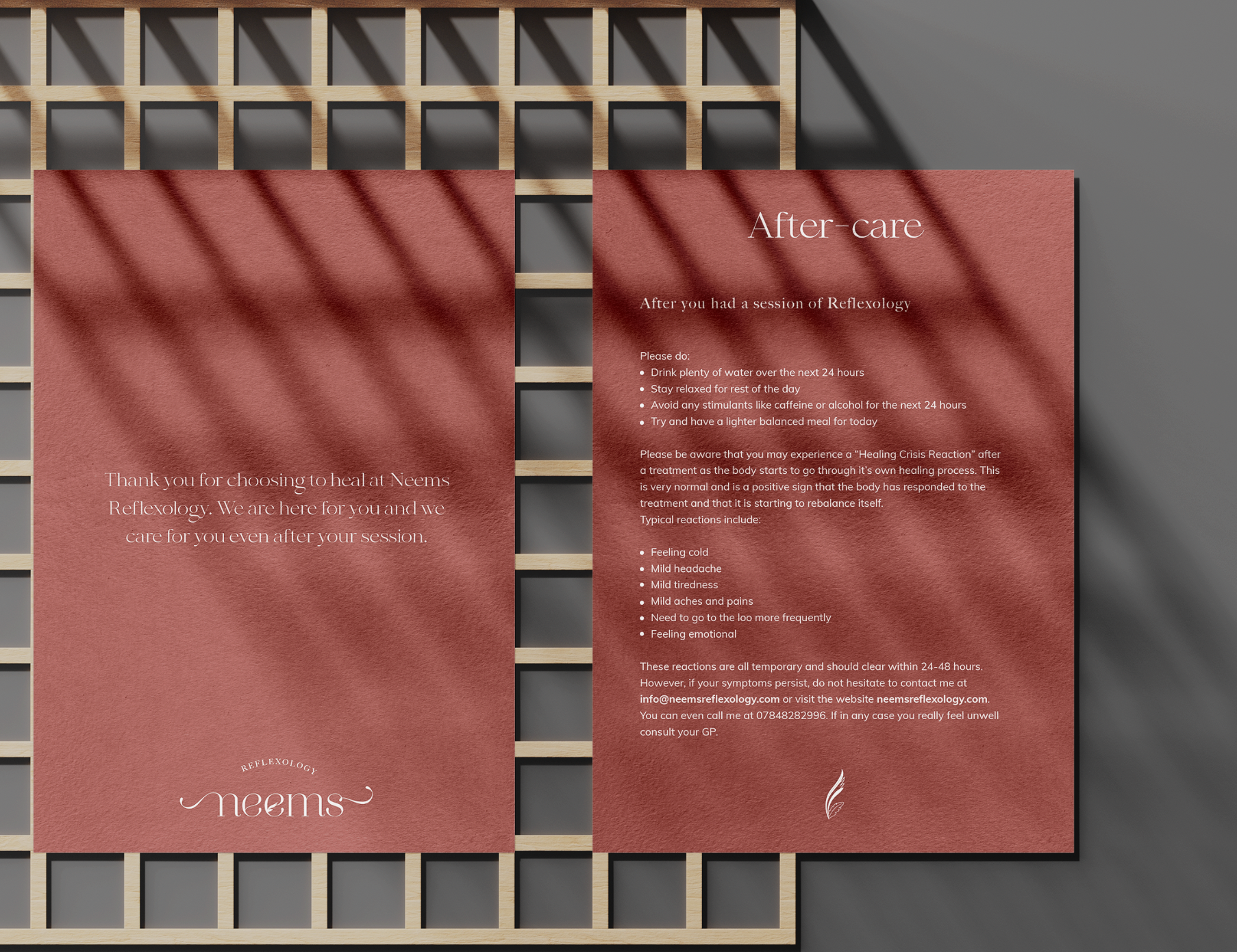
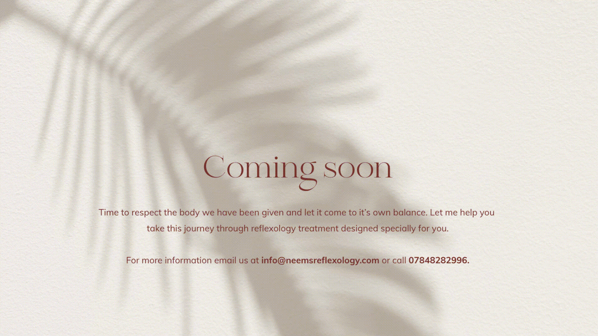
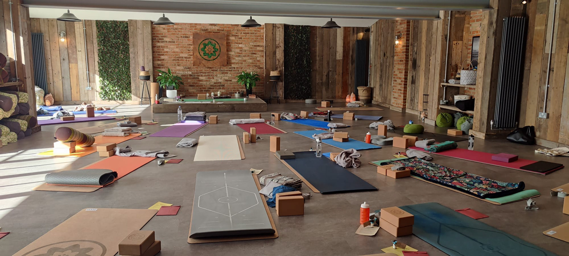
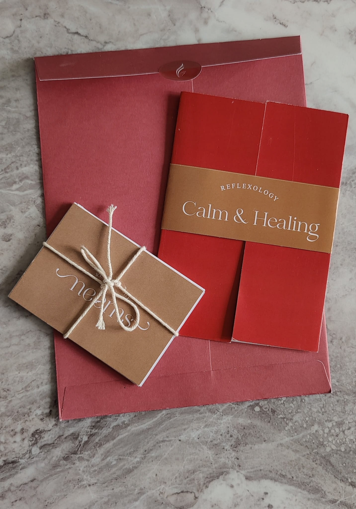
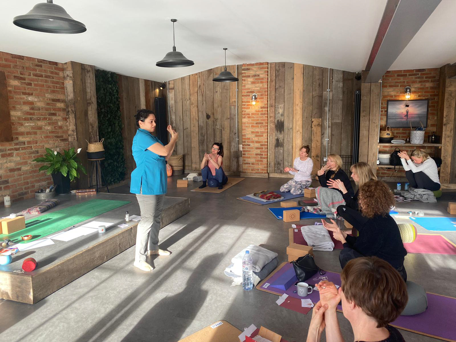
Neems Reflexology encourages the body to re-balance and support it’s own healing and revitalising process. It’s mission is to make each minute of a session, a time to respect the body we belong to. The branding includes a logo reflecting the delicacy of practice and colours inspired by Indian spices, a country from which the concept of reflexology dates back to.